Southern Crafted Website Redesign

Southern Crafted

Southern Crafted

Southern Crafted

Timeline

Sept - Dec 2024

(3 months)

My Role

UX Design

UI Design

User research

Team

Blair Su

Minyan Chen

Linghe Yang

Qingpei Cai

Tools

Figma

Illustrator

Overview

Overview

Overview

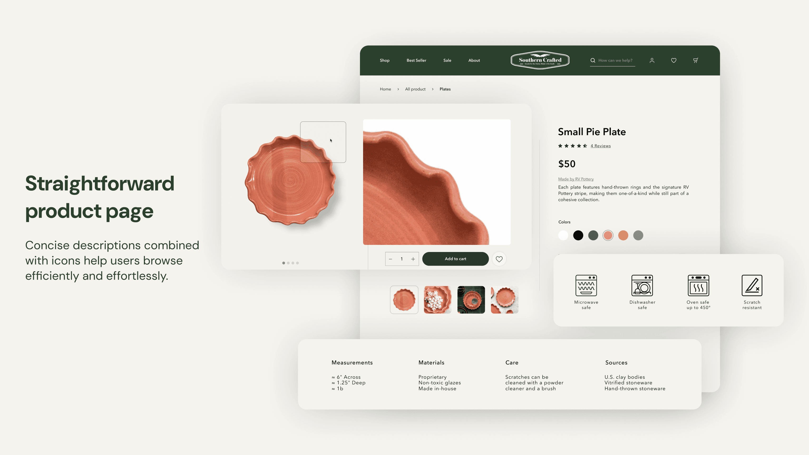
This redesign website revitalizes the Southern Crafted online presence, reflecting the brand’s unique warmth and craftsmanship.

Problem Statements

Problem Statements

Problem Statements

Southern Crafted' s website lacks clarity, appeal, and a strong first impression, leaving users confused when exploring product options and disinterested in learning about the craftsmen.

  • Inefficient purchasing experience

  • Fail to reflect south craftsmanship

  • lack of trust in the product

Design Goal

Design Goal

Design Goal

To help southern crafted's website →

  • More Clear & Clean

  • More Warmth & Crafty

  • More Trustworthy

Process

01 Research

Observe and interview

The insights we gathered from user feedback indicate that we need to improve these information clarity for them.
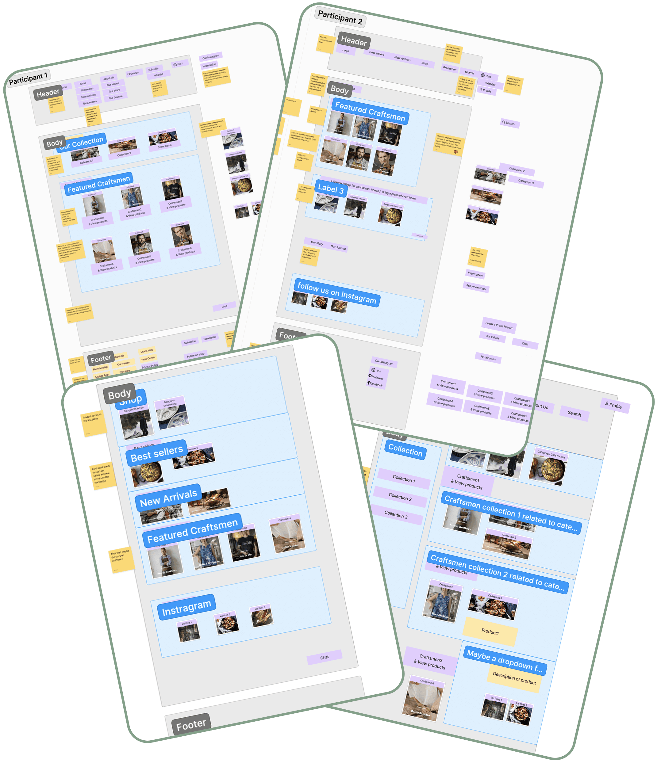
Card sorting

To ensuring that the organization of content on websites aligns with users' intuitions and enhances the overall user experience. We invited four people to participate in our card sorting activity.


Findings: Users believe that "Shop," "About Us," and "Profile" should be presented as dropdown menus, as this aligns with common shopping website layouts.


Findings: For the promotions, users feel confused by the collection names and would prefer to see images first. As for the featured section, since the craftsmen are not well-known, it would be better to showcase their products alongside their introductions.

Contextual inquiry

To understand how our users feel and navigate the original website, we used the method of contextual inquiry. And came up with the following User Journey Map.

02 Design

Information architecture

We have reorganized the IA of the site, reorganized the structure and classification of the site, aiming to solve the problem of difficult to navigate, as well as hard access to information. In addition, UX writing was used to rename some sections to solve the problem that category names were not intuitive. Feel free to drag the button to see how the as-is site map compares to the To-be site map.

Two version's Prototype

In order to better test customer preference, we create two different versions.

Version1: Aligns with the original site’s elegant style
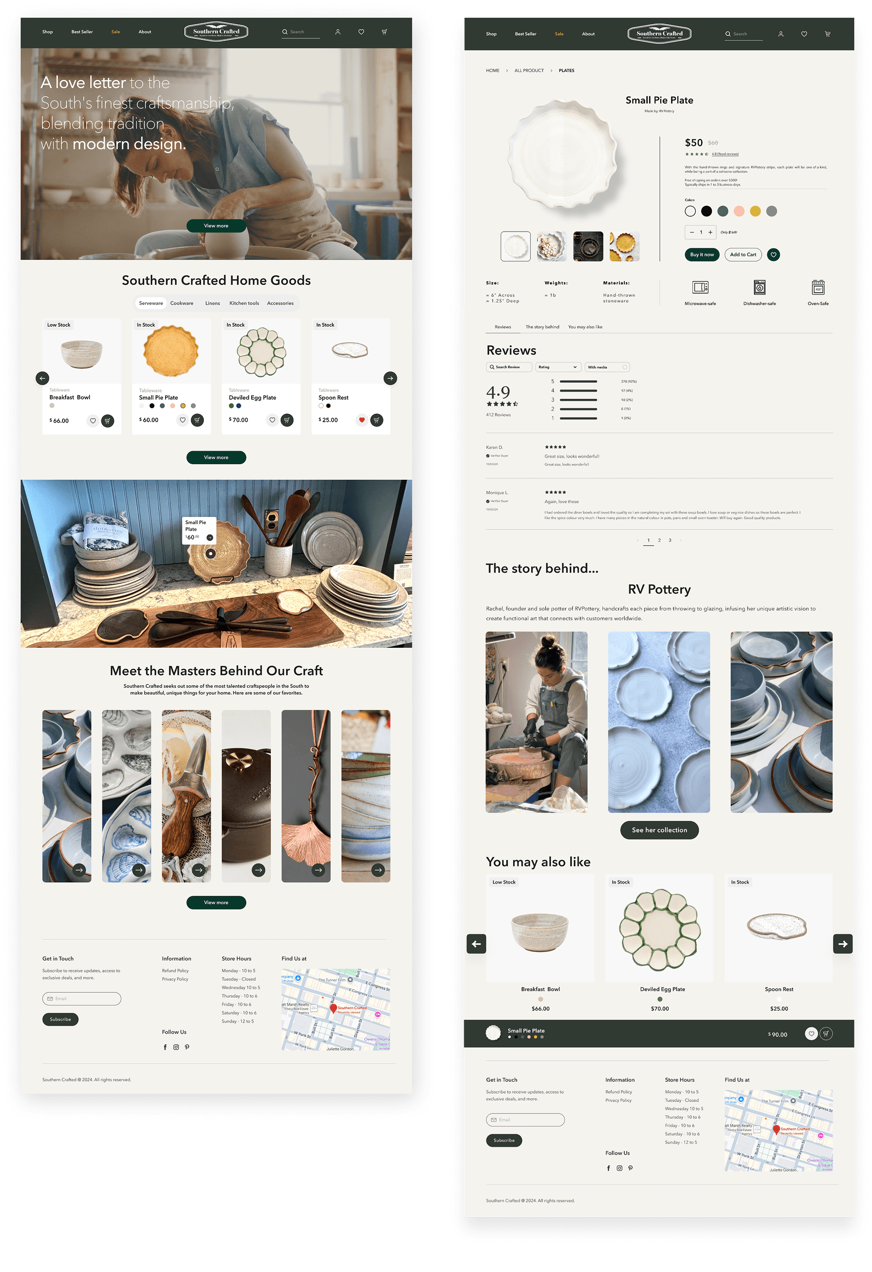
Version 2: focuses on simplicity and clean.
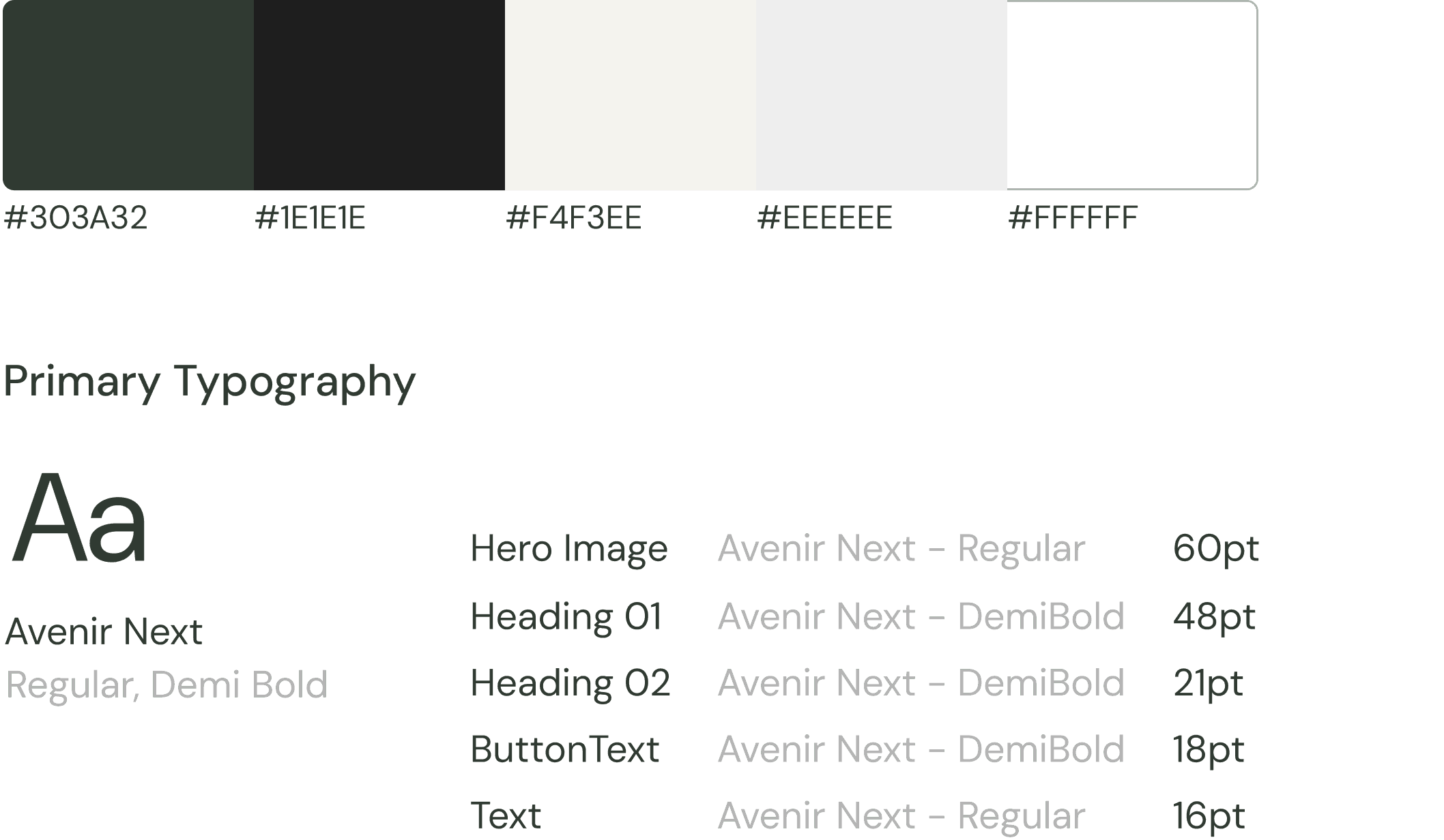
Color & Typography

  • Inspired by the store's interior colors

  • Strong CTA for engagement

  • Evokes warmth and a Southern charm

  • Typography ensures easy navigation

03 A/B Testing & Usability Testing

To identify our users‘ habit and optimize the website to be seamlessly and attractive, we used the method of User Testing and A/B Test.

Test Result & Insight
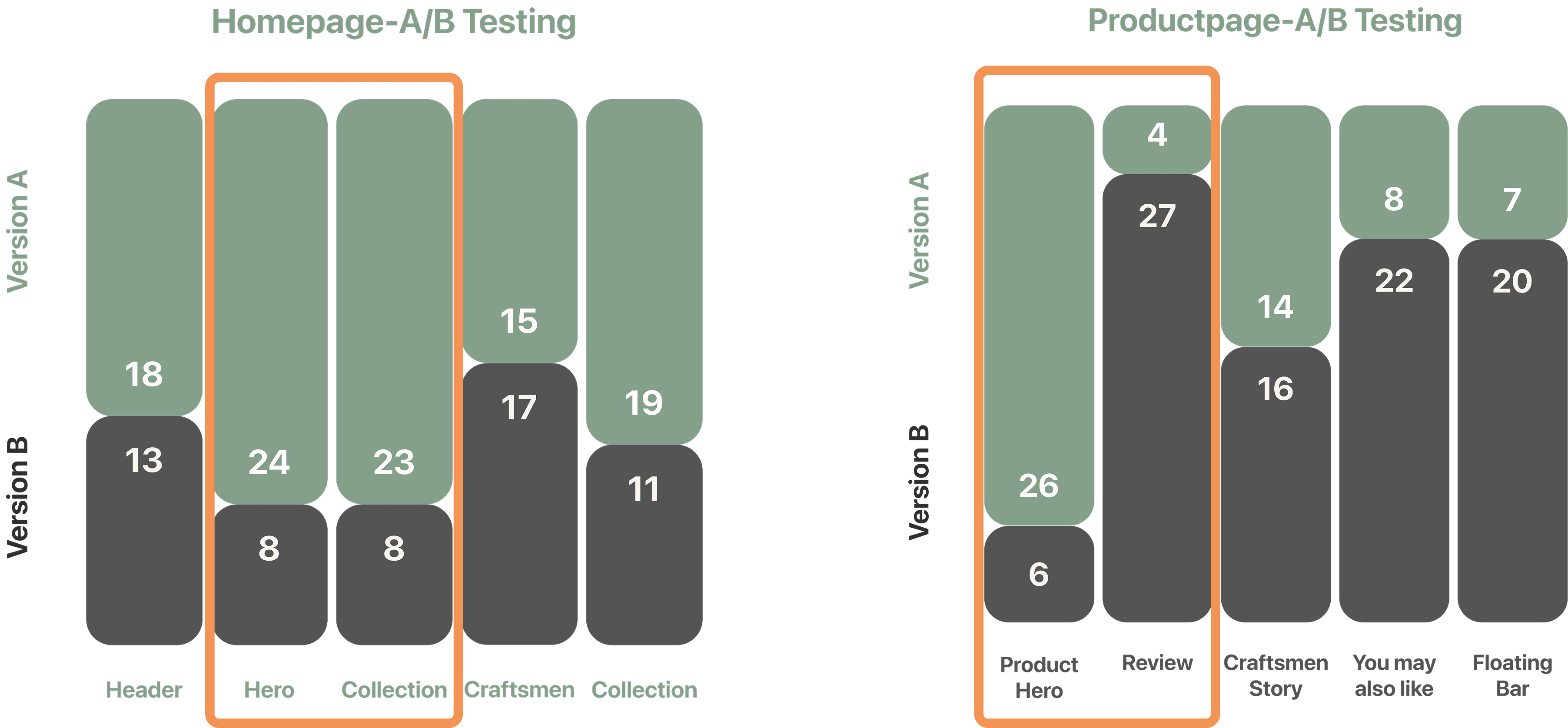
User Prefer…

  • Icons for information

  • Images in the reviews

  • More details in recommendation

  • Big CTA button for quick purchase

Craftsmen

  • Balance between Craftsmen & Products

  • Interaction is good but no over interaction

  • Visual lay out should help providing information

Hypothesis

To identify our users‘ habit and optimize the website to be seamlessly and attractive, we used the method of User Testing and A/B Test.

Hypothesis 1

Placing the search bar at the top left and adding an “Orders & Sign In” dropdown in the header will improve navigation efficiency.

This layout doesn't align with user expectations—users typically prefer to see the "shop" option in the top left and the search bar in the top right.

Hypothesis 2

Using friendly and warm images will increase users' connection with our brand's values.

Testers spent 50 seconds on the homepage, with 13 seconds on the hero image. They described the website as warm, elegant, and welcoming.

Hypothesis 3

Placing the category bar within the collection section will enhance user interaction.

Users enjoy being able to click directly onto the categories and start their shopping journey right away

Hypothesis 4

Directly showcasing the craftsmen's work instead of merely displaying their photos is more likely to capture user interest and encourage further exploration.

Users don’t know what this section was for. They have to read the text to realize it was about craftsmen. Besides, it requires an extra action, which makes it less intuitive.

Then

We iterate

We iterate iterate

We iterate iterate iterate

Let’s meet the new

Let’s meet the new

Let’s meet the new

What I learned?

What I learned?

What I learned?

Users often have a wide range of opinions—even completely contradictory ones. As designers, it's important not to follow every suggestion blindly but to apply our own judgment and insight. Every design iteration will have both supporters and critics; user feedback is valuable as a reference, yet it shouldn't dictate every decision. No design can satisfy everyone, so we must embrace imperfection.

  • More Works More Works